Spectral revision (scroll down for English version) Spectral revision (scroll down for English version)
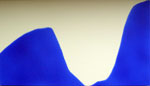 Mit der aktuellen Edition nimmt Tim Otto Roth den farbreflektorischen Faden vom vergangenen Jahr auf. Im Zentrum steht diesmal aber nicht die Koloratur des ältesten Himmelslichtes sondern materielle Farbe wird einer konzeptuellen Neubetrachtung unterzogen. Zwei Kobaltpigmente – Kobaltblau und Kobaltviolett hell – sind in zwei unterschiedlichen wellenartigen Formationen auf dem Papierträger aufgedruckt. Um die Brillanz des Pigmentpulvers zu erhalten, wurde das Pigment mittels eines speziellen Bindemittels – ähnlich wie Yves Klein es verwandte – in einer Sprühtechnik aufgebracht. Mit der aktuellen Edition nimmt Tim Otto Roth den farbreflektorischen Faden vom vergangenen Jahr auf. Im Zentrum steht diesmal aber nicht die Koloratur des ältesten Himmelslichtes sondern materielle Farbe wird einer konzeptuellen Neubetrachtung unterzogen. Zwei Kobaltpigmente – Kobaltblau und Kobaltviolett hell – sind in zwei unterschiedlichen wellenartigen Formationen auf dem Papierträger aufgedruckt. Um die Brillanz des Pigmentpulvers zu erhalten, wurde das Pigment mittels eines speziellen Bindemittels – ähnlich wie Yves Klein es verwandte – in einer Sprühtechnik aufgebracht.
Die Farbe ist dabei doppelt präsent: Einmal physiologisch wahrnehmbar als leuchtkräftiges Pigment und zum anderen als Spektralkurve, die von blau (links) nach rot (rechts) genau zeigt, welcher Teil des Farbenspektrum wie intensiv in dem Pigment bei Bestrahlung absorbiert bzw. reflektiert wird. Schließlich gibt die Spektralkurve auch eine Erklärung dafür, warum der Ton des Kobaltvioletts nicht durch das Mischen von anderen Farben erreicht werden kann.
Das was Joseph Kosuth für das Verhältnis Bild und Text zur Wirklichkeit in seinen konzeptionellen Assemblagen von Objekt, dessen Bild und dessen sprachlicher Bezeichnung als geschriebenes Wort exemplarisch darlegt, erweitert somit Tim Otto Roth auf das noch viel weniger greifbare Konzept der Farbe. Er setzt mit diesem Zyklus so seinen Exkurs in die Gefilde einer Malerie jenseits der Malerei, die er 2002 mit den Imachinationen begonnen hat, fort.
Für 2013 sind von Tim Otto Roth zahlreiche Arbeiten geplant, die diese Revision und Reflexion von Farbe fortführen. Im Frühjahr 2013 erscheint zu dem Thema ein gemeinsam mit dem Astrophysiker Bob Fosbury verfaßter Aufsatz: Roth, Tim Otto; Fosbury, Robert: Colour beyond the sky – the chromatic revolution in astronomy, in: Blassnig, Martha (Ed.): Light, Image, Imagination – The Spectrum beyond Reality and Illusion, Amsterdam (Amsterdam University Press) 2013 (in print).
|
 Spectral revision Spectral revision
 With the recent edition Tim Otto Roth comes back to the colour reflection of the previous year's edition. This time the edition doesn't focus the colour of the oldest celestial light, but material colours are conceptually revised. Two cobalt pigments – cobalt blue and the bright cobalt violet – are printed in two different wavelike formations on the paper. To keep up the brilliance of pigment powder it was used a special binder – similar to the one used by Yves Klein – to fix the pigment in a special spray technique. The colour is present in two ways: On the one side it can be physiologically experienced as a luminous pigment, on the other side as a spectral curve showing from blue (left) to red (right) how intensively the different parts of the colour spectrum are reflected or absorbed by the pigment. Finally the spectral curve gives a hidden explanation why the tone of the cobalt violet can't be reproduced by mixing other colours. With the recent edition Tim Otto Roth comes back to the colour reflection of the previous year's edition. This time the edition doesn't focus the colour of the oldest celestial light, but material colours are conceptually revised. Two cobalt pigments – cobalt blue and the bright cobalt violet – are printed in two different wavelike formations on the paper. To keep up the brilliance of pigment powder it was used a special binder – similar to the one used by Yves Klein – to fix the pigment in a special spray technique. The colour is present in two ways: On the one side it can be physiologically experienced as a luminous pigment, on the other side as a spectral curve showing from blue (left) to red (right) how intensively the different parts of the colour spectrum are reflected or absorbed by the pigment. Finally the spectral curve gives a hidden explanation why the tone of the cobalt violet can't be reproduced by mixing other colours.
It was Joseph Kosuth who demonstrated how differently picture and text are related to reality by his conceptual assemblages of an object, its picture and its verbal description as a written word. Tim Otto Roth extends this conceptual approach to the elusive concept of colour. With this cycle he continues his excursions into the realm of painting beyond painting he initiated in 2002 with the Imachinations.
For 2013 a series of works is planned to continue this revision and reflection on colour. An essay co-authored by the astrophysicist Bob Fosbury will appear in spring 2013: Roth, Tim Otto; Fosbury, Robert: Colour beyond the sky – the chromatic revolution in astronomy, in: Blassnig, Martha (Ed.): Light, Image, Imagination – The Spectrum beyond Reality and Illusion, Amsterdam (Amsterdam University Press) 2013 (in print). |